If you’ve ever wondered what font does ChatGPT use, you’re not alone. Thousands of designers, developers, content creators, and UI enthusiasts ask this question because ChatGPT’s interface feels clean, modern, and incredibly easy to read. Typography plays a major role in creating that smooth reading experience, and OpenAI has carefully selected fonts that balance readability, accessibility, and performance across different devices.
Although many people assume ChatGPT uses a single font everywhere, the reality is a little more interesting. The interface uses modern system-friendly typography that can vary depending on your operating system and browser. In recent updates, OpenAI has also introduced custom typography in parts of the interface to create a more consistent visual identity.
In this guide, you’ll learn what font does ChatGPT use, why it looks so polished, how its typography has evolved, which fonts are the closest alternatives, and what lessons designers can take from ChatGPT’s clean interface.
Why People Ask “What Font Does ChatGPT Use”
ChatGPT has quickly become one of the world’s most popular AI tools. Every day, millions of people use it to write articles, generate ideas, solve coding problems, learn new skills, and research different topics. Whether you’re a student, developer, marketer, or business owner, chances are you’ve spent time reading ChatGPT’s responses.
One thing people quickly notice is how comfortable the interface feels. The text is:
Easy to read
Well spaced
Clean without unnecessary decoration
Comfortable during long conversations
Professional on both desktop and mobile
Because typography directly affects user experience, many people want to recreate the same appearance in their own websites, SaaS products, dashboards, or AI applications.
What Font Does ChatGPT Use?
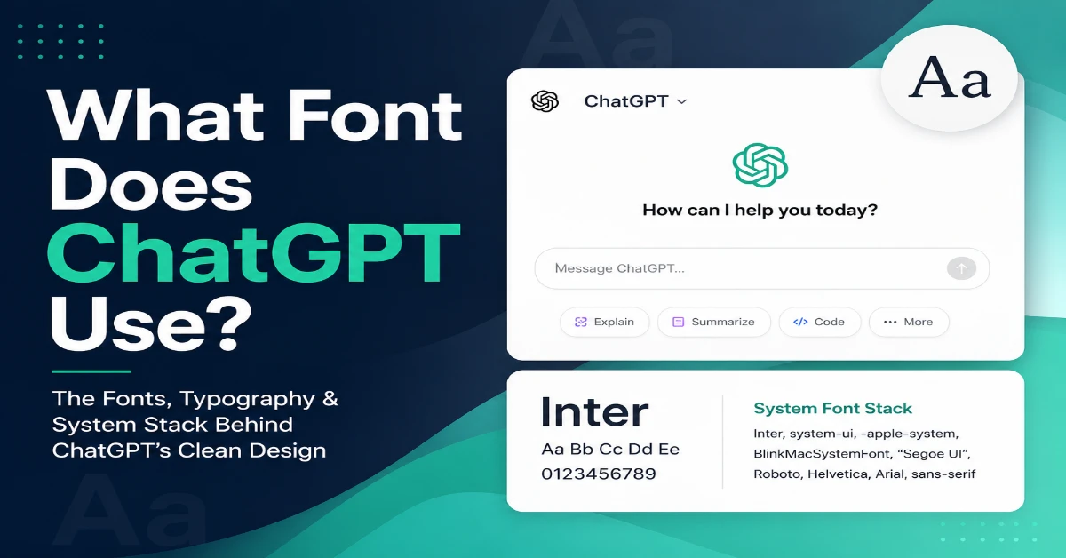
The short answer is that ChatGPT doesn’t rely on a single font. Instead, it uses a modern system font stack, which allows the interface to display the best available font based on your operating system and browser. This approach improves readability, speeds up page loading, and creates a more natural experience across different devices.
Common fonts that appear in ChatGPT include:
- Inter
- SF Pro Display (Apple devices)
- Segoe UI (Windows)
- Roboto (Android)
- Helvetica Neue
- Arial
- Sans-serif fallbacks
OpenAI has also introduced its own branded typography in parts of its products, but for most users the interface still prioritizes readability over decorative design.
The exact font you see may differ slightly depending on your device.
Why Doesn’t ChatGPT Use Just One Font?
Instead of relying on a single font, ChatGPT uses a system font stack. This means the interface automatically selects the most suitable font available on your device. If a preferred font like Inter isn’t installed, the browser seamlessly switches to alternatives such as Segoe UI, SF Pro Display, Roboto, or another system font. As a result, the interface maintains a consistent look while taking advantage of fonts that are already optimized for each operating system.
For example:
Inter,
system-ui,
-apple-system,
BlinkMacSystemFont,
Segoe UI,
Roboto,
Helvetica,
Arial,
sans-serif
Your computer automatically chooses the first available font from the list.
This approach offers several advantages:
- Faster page loading
- Better operating system integration
- Improved accessibility
- Consistent rendering
- Reduced bandwidth usage
This is one reason ChatGPT feels responsive even during long conversations.
The Role of Inter in ChatGPT’s Design
When people try to identify the font behind ChatGPT’s clean interface, Inter is often one of the first typefaces that comes up. Inter is a modern sans-serif font specifically designed for digital screens and user interfaces, making it a popular choice for websites, SaaS platforms, dashboards, and AI applications.
Its clean letterforms make text easy to read, even when users are viewing long conversations or working with smaller text sizes. The font also has a balanced appearance that feels modern without being overly decorative, which fits well with the minimalist design language associated with ChatGPT.
Some of Inter’s key strengths include:
- Excellent readability: Characters remain clear and distinct at different screen sizes.
- Modern appearance: Its simple design works well with clean, minimal interfaces.
- Wide language support: Inter includes a broad range of characters and symbols.
- Balanced spacing: Carefully designed letter spacing makes long blocks of text more comfortable to read.
- Open-source availability: Developers can use Inter in both personal and commercial projects.
It’s important to note that Inter should not automatically be considered the only font used throughout ChatGPT. The exact typeface rendered on your screen can depend on the current interface, browser, operating system, and font stack. However, Inter remains a useful reference point for designers who want to create a similar clean and professional visual experience.
How ChatGPT Typography Improves User Experience
Typography is about much more than simply choosing a font. In an interface like ChatGPT, the combination of font style, size, spacing, contrast, and visual hierarchy plays an important role in making long conversations comfortable to read.
When users spend hours reading AI-generated responses, poorly designed typography can quickly cause eye strain and make information harder to understand. ChatGPT’s clean interface avoids many of these problems by using a simple visual structure that keeps the focus on the content.
Here are some of the key typography principles that improve the overall user experience:
Comfortable Font Size
The text is designed to remain readable without taking up too much space on the screen. A comfortable font size allows users to read lengthy responses without constantly zooming in or feeling overwhelmed by oversized text.
Proper Line Spacing
Adequate space between lines helps separate individual sentences and makes paragraphs easier to scan. This becomes especially important when reading long AI-generated responses.
Strong Contrast
Good contrast between text and the background improves readability in both light and dark interface modes. It also helps users with different visual needs interact with the content more comfortably.
Clear Visual Hierarchy
ChatGPT uses different visual treatments for headings, paragraphs, lists, links, and code blocks. This hierarchy helps users quickly identify important information and navigate lengthy responses.
Minimal Visual Clutter
The interface doesn’t rely heavily on unnecessary decorations or distracting visual elements. By keeping the design relatively simple, ChatGPT allows typography and content structure to take center stage.
Consistency Across Devices
A responsive typography system helps maintain a familiar experience across desktop computers, tablets, and mobile devices. Even when the exact font rendering changes between operating systems, the overall reading experience remains consistent.
Ultimately, the success of ChatGPT’s typography isn’t based on one particular font alone. The combination of readable typefaces, appropriate spacing, strong contrast, clear hierarchy, and responsive design is what makes the interface comfortable for extended use.
Does ChatGPT Use Different Fonts for Code?
Yes.
Code blocks usually use a monospace font rather than the standard interface font.
Monospace fonts ensure every character occupies the same width.
Benefits include:
- Easier debugging
- Better alignment
- Improved code readability
- Cleaner formatting
Popular monospace fonts include:
- Menlo
- Consolas
- Monaco
- SF Mono
- Courier New
These fonts make programming examples significantly easier to understand.
Has ChatGPT’s Font Changed Over Time?
Yes.
Since ChatGPT launched, OpenAI has updated its interface several times.
Changes have included:
- Better spacing
- Improved accessibility
- More refined typography
- Updated button styles
- Cleaner navigation
- Improved mobile responsiveness
While the overall design philosophy has remained consistent, the typography has become more polished with each update.
Why Typography Matters in AI Applications
AI tools often present large amounts of information.
Users may spend hours reading responses, reviewing code, editing articles, or researching topics.
Good typography helps by reducing cognitive effort.
Benefits include:
- Faster reading
- Better comprehension
- Lower eye fatigue
- Improved accessibility
- Increased user satisfaction
This is why nearly every successful AI platform invests heavily in typography and interface design.
Fonts Similar to ChatGPT
If you’d like your website or application to have a similar appearance, several fonts deliver a comparable experience.
Inter
The closest overall match.
Perfect for:
- AI websites
- SaaS dashboards
- Startup landing pages
- Productivity tools
SF Pro Display
Apple’s system font offers exceptional clarity.
Best suited for macOS and iOS applications.
Segoe UI
Windows users are already familiar with Segoe UI.
It provides a clean, professional appearance.
Roboto
Google’s Roboto remains one of the most versatile interface fonts.
It performs well across Android devices and websites.
Helvetica Neue
A timeless modern sans-serif font that has influenced countless interface designs.
Open Sans
Known for excellent readability across websites and mobile devices.
How to Identify the Font Used by ChatGPT
If you’re curious about the exact typography on your own device, you can inspect the interface using your browser.
Most browsers allow you to:
- Right-click on text.
- Choose Inspect.
- Open the Computed Styles panel.
- Look for the font-family property.
You’ll often see the entire font stack rather than a single font.
Remember that the displayed font depends on your operating system and installed fonts.
Inspecting ChatGPT’s Font on My Device
To verify which font ChatGPT uses, I opened ChatGPT in Google Chrome on a Windows PC and used the browser’s Inspect tool (right-click → Inspect). In the Computed or Styles panel, I checked the font-family property. Instead of showing a single font, it displayed a font stack that included modern sans-serif options such as Inter, Segoe UI, and system fonts. Because Windows prioritizes installed system fonts, the exact font rendered depended on my operating system. I repeated the same process in Microsoft Edge and observed similar results, confirming that ChatGPT relies on a flexible font stack rather than one fixed typeface.
Can You Use the Same Font on Your Website?
Yes.
Many of ChatGPT’s closest fonts are freely available.
A typical implementation looks like this:
font-family:
Inter,
system-ui,
-apple-system,
BlinkMacSystemFont,
“Segoe UI”,
Roboto,
Arial,
sans-serif;
This gives visitors an experience similar to many modern SaaS applications.
Design Lessons You Can Learn from ChatGPT
Rather than focusing only on the font, it’s worth understanding the broader design principles behind ChatGPT’s interface.
Prioritize readability
Fancy typography rarely improves usability.
Simple fonts are usually the better choice.
Use whitespace generously
Spacing between paragraphs makes content easier to digest.
Build a clear hierarchy
Headings should stand out while body text remains comfortable to read.
Maintain consistency
Using the same typography throughout your product builds familiarity.
Design for accessibility
Readable fonts, sufficient contrast, and scalable text improve the experience for every user.
Final Thoughts
If you’ve been searching for what font does ChatGPT use, the answer is that ChatGPT relies on a combination of modern sans-serif fonts and system font stacks rather than a single typeface. Depending on your device, you may see Inter, SF Pro Display, Segoe UI, Roboto, or another optimized system font. This flexible approach helps deliver excellent readability, faster loading times, and a consistent experience across platforms.
The biggest takeaway isn’t simply choosing the same font—it’s understanding the design philosophy behind it. Clean typography, thoughtful spacing, strong accessibility, and a clear visual hierarchy all contribute to the smooth reading experience that ChatGPT is known for. If you’re designing your own website, app, or AI product, focusing on these principles will have a much greater impact than copying a specific font alone.
Frequently Asked Questions
Inter is widely recognized as one of the fonts associated with ChatGPT’s interface, although the exact font displayed depends on your operating system and browser.
Yes. ChatGPT commonly relies on a modern system font stack to improve performance and provide a native feel across different devices.
Inter is considered one of the closest free alternatives. It offers excellent readability, modern styling, and is widely used in professional web interfaces.
The polished appearance comes from a combination of readable typography, consistent spacing, strong visual hierarchy, accessible color contrast, and a minimalist interface design—not just the font itself.
Yes. Fonts like Inter, Roboto, Segoe UI, and system font stacks are excellent choices for creating a clean, user-friendly website inspired by modern AI interfaces.